Over my years working in interior design, I’ve learned how to use Neutral Plaster Wall Art to quickly and affordably transform dull, characterless rooms. With some strategic placement and styling, this budget-friendly decor can make a major impact.
In this article, I, Mark Cutler share my tips for selecting and arranging neutral plaster art that enhances your space without overpowering it. You’ll also find suggestions for displaying these minimalist pieces in ways that add interest and personality with Nousdecor!
Takeaways
- Plaster wall art in neutral tones like white, beige, and gray blends seamlessly into many color palettes. It provides subtle texture without competing with other décor.
- Strategically placing and arranging wall art creates visual impact and brings life to bare walls. Repeating shapes, sizes, and frames adds cohesion.
- Layer these sculptural pieces over wallpaper or colored paint for extra dimension. Add lighting to create dramatic shadows and highlights.
- Incorporate organic shapes and textures for a relaxed vibe. Geometric designs and clean lines feel more modern and sleek.
- Wall art doesn’t have to be expensive — even on a budget, neutral plaster pieces bring affordable style to forgotten spaces.
The Subtle Impact of Neutral Plaster Wall Art
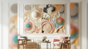
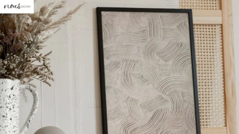
Minimalist wall art made from plaster or other composite materials has become popular for good reason. These textured, neutral-toned pieces blend effortlessly into both warm and cool color palettes. Unlike boldly-colored art, subtle beiges, whites, and grays provide interest without competing for attention.
In small doses, this muted wall art instantly enhances lackluster, nondescript rooms. A few strategically placed sculptural pieces break up large empty walls and add much-needed visual texture. Without dominating the space, neutral wall art creates a peaceful ambiance. It allows other décor to shine while providing an understated backdrop.
Selecting the Right Pieces
When choosing neutral plaster art, consider your room’s existing design. Organic, abstract shapes often complement bohemian or eclectic spaces, while geometric designs fit better in modern or contemporary homes. Sleek, clean lines also pair nicely with Scandinavian and industrial rooms.
While wall art need not match your decor exactly, some cohesion creates a pulled-together look. For example, circular art complements rounded furniture and arched doorways. Repeat visual themes of your overall aesthetic.
Since subtlety is key, avoid pieces that are too overpowering in size or design. Look for mid-sized art — very small pieces get lost, while oversized ones overwhelm. Simple, not-too-busy designs allow the wall texture itself to shine.
For more tips, check out our guide on how to make plaster wall art instead! Now we’re moving on to hanging your plaster art!
Hanging with Purpose
When it comes to hanging neutral wall art, placement, and arrangement make all the difference. Aim to break up large expanses of empty space in a purposeful way. Strategically place the art to enhance — not compete with — existing architectural details.
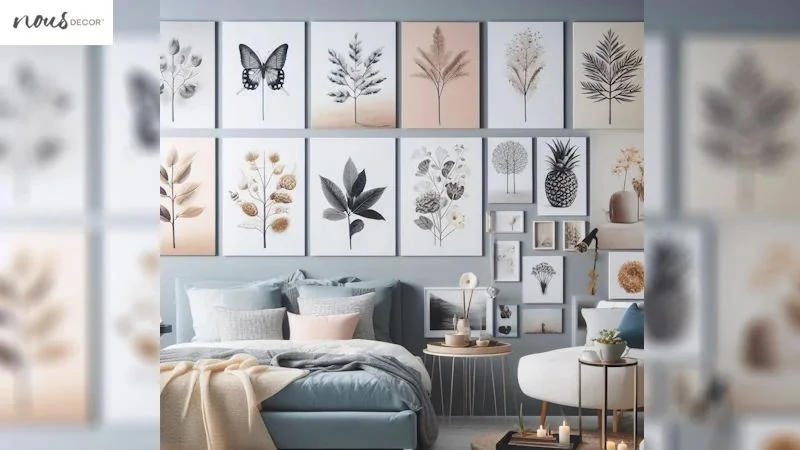
Hang wall art at eye level so it is easy to admire. Arrange pieces in asymmetrical groupings for visual interest; matching frames and mats create pleasant cohesion. Repeat shapes and textures throughout the space for a collected, curated look.
Here are some tried-and-true tips for hanging plaster wall art:
- Group 3-5 pieces over sofas or beds
- Flank windows or doors with matching panels
- Create gallery walls with a mix of shapes and sizes
- Align artwork to furniture or borders to ground the look
Experiment until you find an arrangement with visual balance. Step back frequently to check the overall effect.
Styling Neutral Artwork
Proper styling brings neutral wall art to life. Clever techniques make ordinary pieces extraordinary through the interplay of light, color, and texture. Here are some of my favorite ways to showcase simple plaster art for walls:
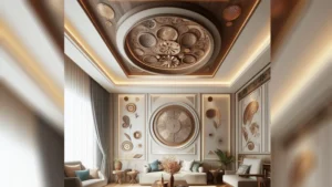
- Highlight with wallpaper or paint: Layer sculptural art over bold, colorful backgrounds for added dimension. Neutrals pop against dark hues like navy or emerald. For impact, hang a geometric piece within a vibrant wallpaper pattern.
- Add dramatic lighting: Spotlights and track lighting cast shadows that emphasize texture and dimension. Illuminate artwork with pendant lights or picture lights. Place it near sunny windows to capture natural light.
- Incorporate wood tones: Bring in wooden frames, furniture, cabinets, or shelves near the artwork. Natural wood grains complement the plaster’s matte finish.
- Style with greenery: Trailing vines, potted plants, or fresh blooms contrast beautifully with neutral art. Greenery brings an organic touch to sleek, geometric pieces.
- Use as a textural layer: Hang wall art over upholstered headboards, wool blankets, rattan chairs, or other tactile materials. Mixing textures makes the space visually appealing.
Affordable and Impactful
The best part of neutral plaster art? It transforms rooms without a huge decor investment. For less than the cost of a single colorful plaster canvas art materials, you can adorn multiple walls with lovely sculptural pieces.
Look for sales, shop thrift stores, and seek out Etsy finds to save money. Frame affordable art panels from big box stores in decorative frames for a custom look. With a bit of creativity, you can reinvigorate forgotten spaces on a budget.

In the end, even inexpensive wall art adds lovely texture and interest when thoughtfully displayed. With strategic placement and creative styling, neutral plaster pieces turn dreary, nondescript rooms into artful sanctuaries.
Frequently Asked Questions
Conclusion
Revitalizing lackluster rooms and making your home beautiful with wall art doesn’t require an art budget. With smart selection and strategic display, even budget-friendly neutral plaster art makes a noticeable impact. Its subtle texture transforms boring walls without overpowering the space or your existing decor.
With a mindful arrangement and creative modern plaster art techniques, you can take inexpensive art from forgettable to striking. Layer, highlight, and complement these sculptural pieces to make them shine. Before you know it, your formerly bland walls will have life, interest, and visual joy.